Whether you’re decorating a room, designing a brochure or creating a work of art you’ll need to choose a color palette. Try these tips to find a palette that’s perfect and perhaps a little unexpected.
1. Take a Cue from Nature
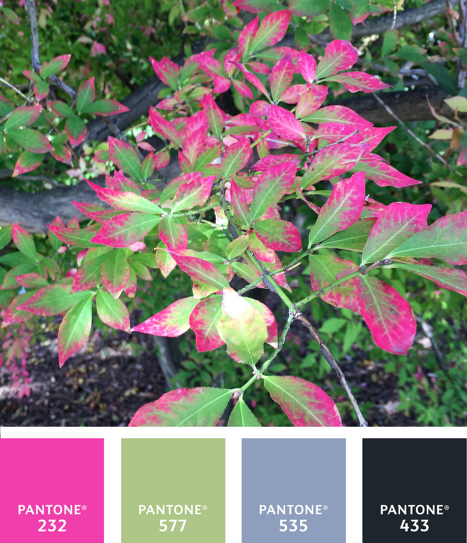
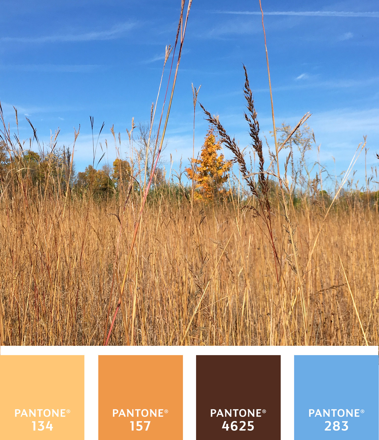
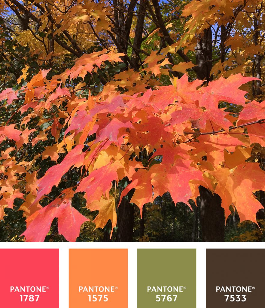
Be inspired by your walk through the woods or near the lake. If you see a scene you find colorfully pleasing, snap a photo and store it for another day when you need a spark.
2. Choose a Color Scheme from your Photo
Once you’re ready to design or decorate, pull up your photo and pluck colors you like from the scene. Consider what colors bring the image its interest. Don’t pick all of them, try picking a few of your favorites, one dominant, one secondary and a few accents. For a neutral color, look to the photo for light colors and beiges.
3. Use the Golden Rule of 60-30-10
When decorating a space, or designing a piece, you can pick colors using a rule from ancient Greek art to guide you. It’s a way to balance the visual experience. Divide your colors into components of 60% of a dominant color, 30% of a secondary color and 10% of the accent colors.
4. Pick One Side or Both
Take a peak at a color wheel and consider where your color choices fit on the wheel. Colors next to each other such as blue and green are more casual and relaxing, while choosing colors that live across the wheel from each other will create a more energetic and vibrant feel.
5. Grays can Pack a Punch
Even if you’re looking for a neutral palette, these ideas still apply: use today’s trendiest color, gray, to make it work. Gray’s Swiss-like quality of neutrality can appear either warm or cool and pairs beautifully with both pastels and poppy colors like hot pink or grassy green.